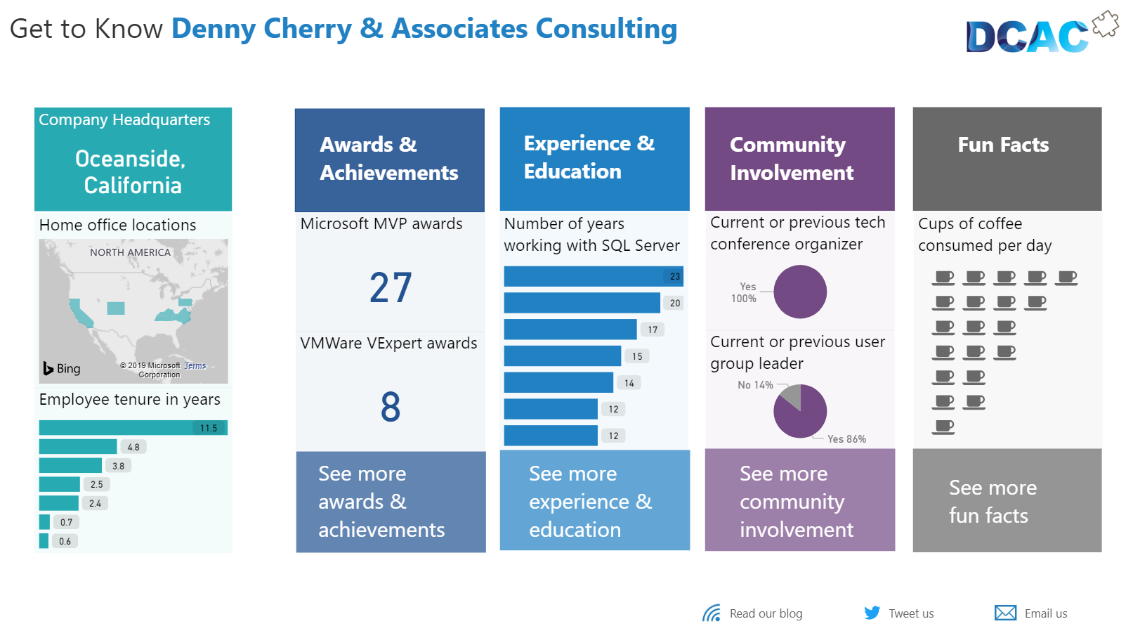
We often focus on deep analysis and insights generated by machine learning when we talk about Power BI these days because it’s super cool and very fancy. But I think it’s important to remember that you can also use Power BI for simple communication of data. As humans, we are hard wired to process visual information faster than text alone. And it’s often more efficient and concise to convey information in a visual rather than text. We can show in one image what it takes paragraphs to describe. Outside of historical analysis and operational reporting, we can use data visualizations as an engaging way to convey simple facts in a communication or marketing effort. Many people do this with infographics.
Visualization can make simple numbers and facts more memorable and engaging. I enjoy using Power BI for this marketing communication purpose, so I made a report about the people I work with at Denny Cherry & Associates Consulting. I knew most of them before I started working at DCAC, so I was already aware that they were exceptional. But now you can see it, too, with our new Power BI report located at https://www.dcac.com/about-us/learn-more-about-us.

Data is some people’s preferred language. We can use it to discuss specific points as well as broader trends and comparisons. I have a sticker on my laptop that says “Please Talk Data To Me” for a reason. I can make sweeping statements about how my team is full of accomplished consultants, speakers, and authors. But it is much more impactful when you see the numbers: 27 Microsoft MVP awards and 8 VMWare VExpert awards over the years, a combined 113 years of experience with SQL Server, 86% of us having been a user group leader.
And because Power BI is interactive, you get to interact with my report, choosing which categories you want to learn more about. There is also a little guessing game built into the report. (Although there is currently a Power BI bug that I had to work around, so the answers are limited to values 1-800 and 2001-2300. But that is a blog post for another time, and for now you get a hint as to possible answers.) If I had just told you these stats, you might have listened, but you probably would have tuned out.
Our team even had fun browsing the report, seeing our collective achievements, and guessing who provided which answers.
Building the report
It was quick and easy to use Microsoft Forms to gather the data and then dump the responses to Excel. From there, I made a quick Power BI data model and put together my visualizations. The report is embedded on our website using a Publish to Web link. A few people have said they would like to do something similar for their organizations, so I’ll offer a couple of tips:
- Make sure the questions you ask aren’t violating any HR rules, and that employees know that some or all questions are optional. For example, I asked personal questions in the Fun Facts section about number of children employees have. This question was optional and our team felt comfortable answering it.
- Try to group your questions into categories so you can easily the separate sections and pages like I did. Then you can associate a color with each category.
If you do make something similar, I’d love to see it. Tweet me a link or screenshot at @mmarie.
