At PASS Summit, I presented a session called “Do Your Data Visualizations Need a Makeover?”. In my session I explained how we often set ourselves up for failure when conducting explanatory data visualization before we ever place a visual on the page by not preparing appropriately, and I provided tips to improve. I also gave examples of visual design mistakes I see often. I polled the audience, and they shared some mistakes that they had seen often or that really bothered them. If you missed my presentation, you can watch it on PASS TV or Youtube.
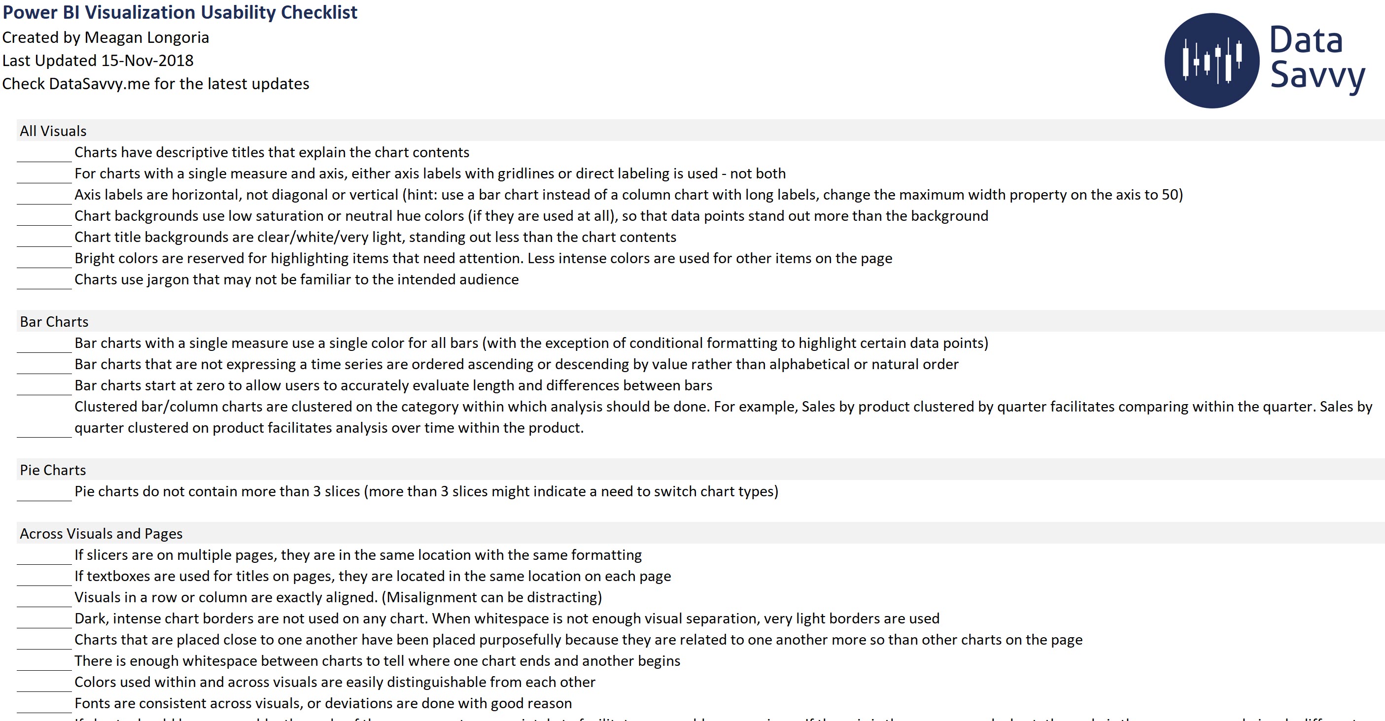
As a companion to my presentation, I created the Power BI Visualization Usability Checklist. For those who are new to data visualization in Power BI, or those that want to employ some type of quality check, I think this is a good place to start. I occasionally do data viz makeover engagements to help people create a report that is more engaging and more widely adopted. This list draws from that experience as well as the tweaks I find myself making to my own Power BI reports. And now I have added a few things that my PASS Summit audience mentioned – thanks to those who shared their suggestions and experiences!
I’m not here to tell you to always use a certain color theme or font, or that everything should be a bar chart. Data visualization is situational and dependent upon your intended audience. I hope I can encourage you to consider your audience, how they take in information, and what information they are looking for.
This checklist provides guidelines to help make sure your report communicates your intended message in a way that works for your intended audience. It has two pages. The Data Viz Usability Checklist page contains the main checklist for you to use while building or reviewing a Power BI report.
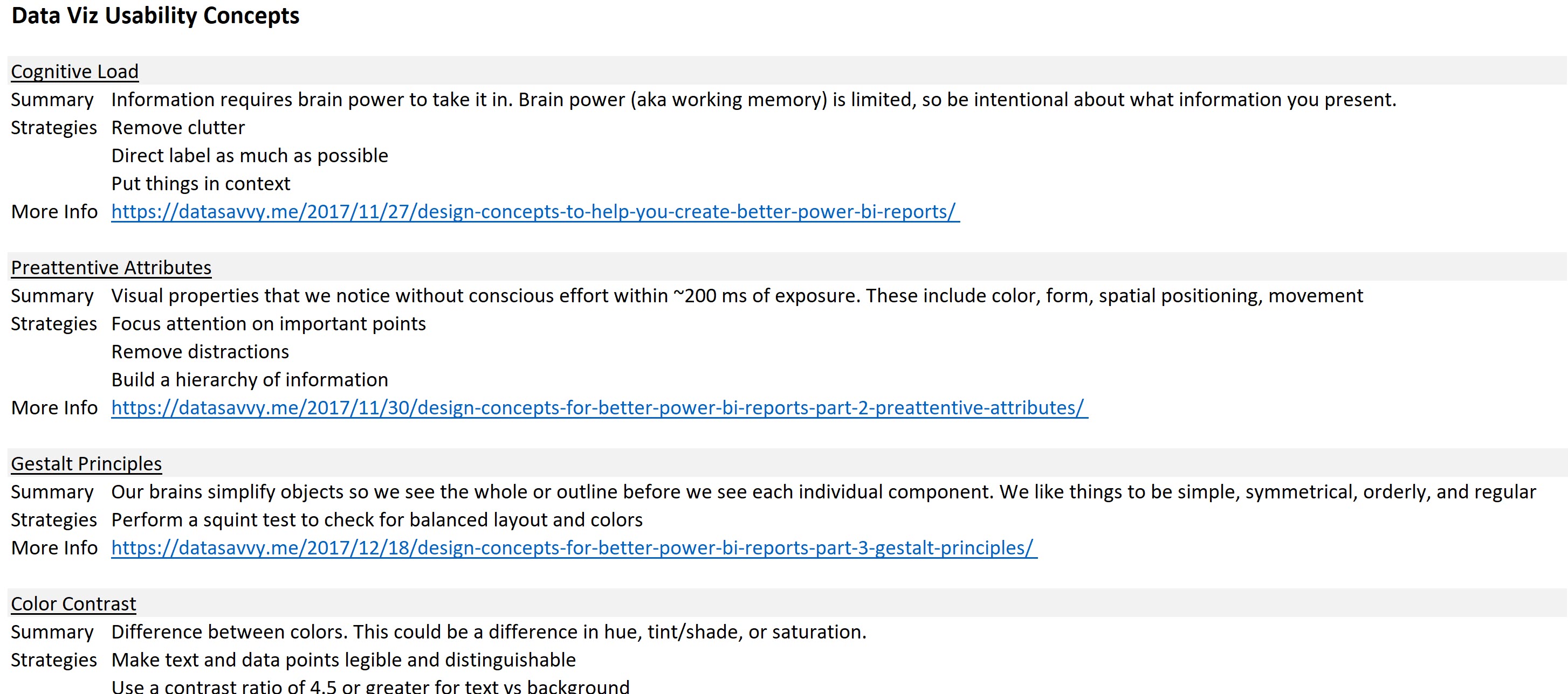
The Data Viz Usability Concepts page gives you quick definitions and links for further reading about the underlying design concepts that inform my list.
Download the checklist here. I also have a checklist for accessibility in Power BI reports which you can find here.
If you have a suggestion to add to either list, please leave me a comment!