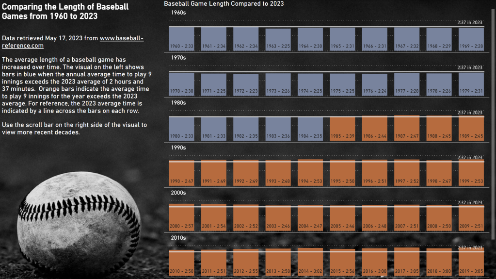
Did you know that you can create labels on bar charts that don’t use the fields in the field wells? You absolutely can!
I did this in the exercise for Workout Wednesday 2023 for Power BI Week 20.

Notice the label on each column that shows the year and average game length in h:mm format.
These custom labels are available for any bar or column chart – small multiples are not required.
How to add custom labels
The setting for these labels is a little bit hidden. On my column chart, I went to Format Pane, located the Data labels section, and found the Values area. Under Values, there is a toggle for Custom label that must first be enabled before populating the Field below it.

You can drag any field in the fields list into the custom label field. It only accepts one field, so if you want to display multiple values, you’ll need to create a custom column to concatenate values. That is exactly what I did in my example report.
You can control the orientation and position of the labels (mine are set to horizontal and inside base). You can also format the label values and background.
Happy labeling!
