Last week, I had a conversation on twitter about dealing with corporate color palettes that don’t work well for data visualization. Usually, this happens because corporate palettes are designed with websites and/or marketing collateral in mind rather than information graphic design. This often results in colors being too bright, dark, or dull to be used together in a report. Sometimes the colors aren’t easily distinguishable from each other. Other times, the colors needed for various situations (main color, ancillary colors, highlight color, error color, KPIs, text, borders) aren’t available in the corporate palette.
You can still stay on brand and create a consistent user experience with a color palette optimized for data visualization. But you may not be using the exact hex values as defined in the corporate palette. I like to say the data viz color palette is “inspired by” the marketing color palette.
I asked on twitter if anyone had a corporate color palette they needed to convert into a data visualization palette, and someone volunteered theirs. So this post is my walk-through of how I went about creating the palette.
Step 1: Identify a Main Color
There is often a main color in the corporate color palette. If that color is a medium intensity color, I usually include that color in my color palette as is. If it is excessively dark, light, or gray, I’ll either tweak the color a bit or use the second color in the color palette.
Step 2: Choose a Color Scheme
Next, I need to decide what kind of relationship the other colors will have with the main color. In other words, I have to decide what type of color scheme I want to use. I tend to go for monochromatic or analogous color schemes. Complimentary color schemes can be difficult, depending on your main color. I generally try to stay away from using reds and greens together in the same palette because it’s hard to stay colorblind-friendly and because the primary colors together can make it feel like a Christmas or kindergarten theme. I often try to reserve reds and oranges to draw attention to specific data points, but that isn’t a hard and fast rule.
I need 2 – 4 ancillary colors to go with my main color. I rarely need to use all 4 colors together in one chart, but there are some cases such as line charts with 4 series where that will be necessary. People can preattentively distinguish up to about 7 colors at once, so I need to use fewer than 7 colors in a single chart. If I encounter a situation where I feel like I need more than 4 colors together, I re-evaluate my choice of chart type and my use of color within the chart.
Also, I want the colors to be roughly the same level of brightness and intensity. Most importantly, the colors need to be easily distinguishable from each other.
Step 3: Choose Highlight and Error Colors
We often need to draw attention to specific data points to indicate that they require attention. This is usually because a value is outside of the expected range. KPIs are common in Power BI reports, I need to make sure I have a color to indicate “bad” statuses. I also like to have a highlight color that doesn’t necessarily mean “bad”, just “look here”. These highlight and error colors need to be noticeably different from my other colors so that they draw attention to the data points where they are used.
Step 4: Add Border and Background Colors
I like to add grays and browns to go with my color scheme. I’ll use them mostly for borders, grid lines, text, and light background shades. But also, I want to make sure I have 8 colors in my palette. If I have fewer than 8 colors, Power BI will add colors from the default palette at the end of my colors to fill out the full 8 columns.
Color Palette Creation Example
The original corporate color palette that I was given had a lot of colors.


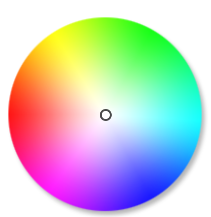
The primary colors go all the way around the color wheel. I definitely don’t want to use them all together. The secondary colors have the beginnings of a monochromatic blue palette, an analogous blue/green palette, or an analogous orange/red/purple palette.
I don’t need all of these different hues. I need 8 medium-intensity colors. Power BI will add black and white and provide the shades and tints for me.
Main Color
I’m keeping the main color as it is. It is bright and saturated enough to not be dull/boring and also not so bold as to leave no room for bolder colors to be used to highlight specific data points.
Color Scheme
I choose an analogous color scheme, which means I pick colors that are next to my main color on the color wheel. Since blue is my main color, I stick with cool colors for the ancillary colors.

I want my 4 colors to be easily distinguishable from each other, and I want them to be roughly the same intensity and brightness.
Highlight and Error Colors
I’m adding yellow and red to my palette. The yellow can be a generic highlight color as well as a “caution” color. The red can be my “bad” color. I’m checking that my colors are easily distinguishable for various types of color vision deficiency.
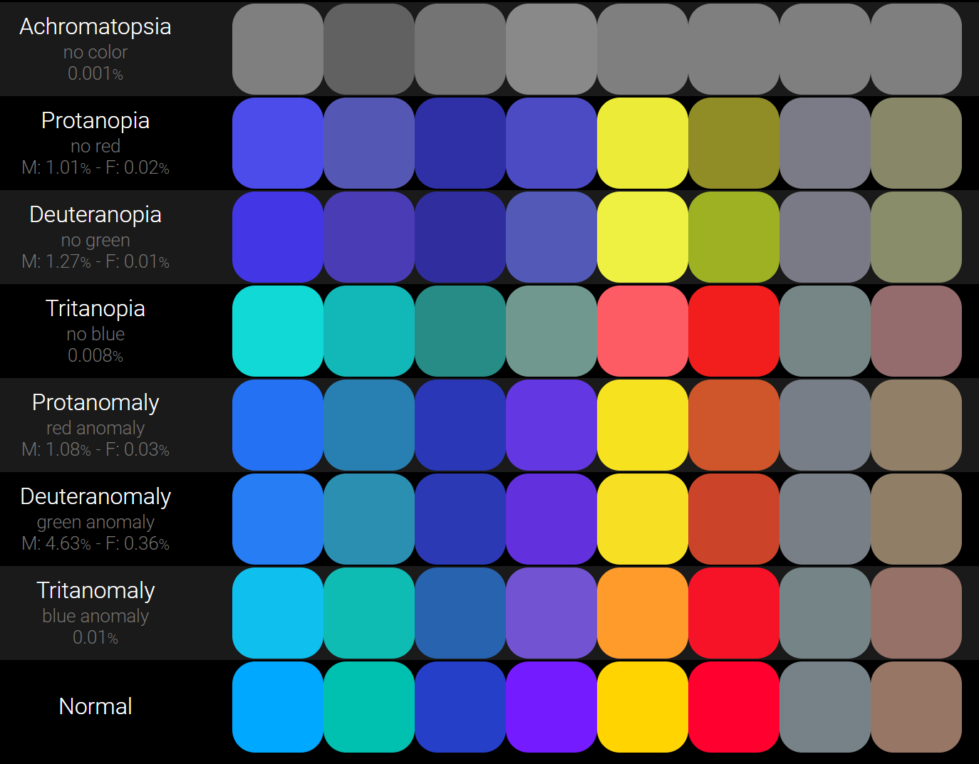
I confirm that my highlight and error colors are easily distinguishable from the other colors for the most common types of color vision deficiency. I can also see here that my second and fourth colors look a bit similar on the deuteranopia line, so I’ll have to be careful how I use them together, perhaps switching to a shade or tint of the fourth color if needed.
Border and Background Colors
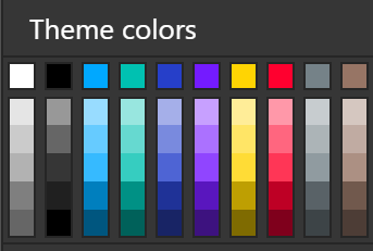
Now I add my grays and browns to use for formatting. This completes my color palette.

Power BI Theme
I can take the hex values for my colors and drop them in the color theme generator on PowerBI.Tips to get my JSON theme file.
{
"name":"Analogous",
 "dataColors":["#00aaff", "#00c2b2", "#213dca", "#7514ff", "#ffd500", "#ff002b","#768389","#987665"]
 }
When I import my theme file into my Power BI report, I get the additional tints and shades from the colors I provided.
Next I try out my new color theme in a report to see if I need to tweak any colors. This is the true test. The colors may look great in little boxes, but they might need to be altered to work on a full report page. The shade of purple that I used originally (not shown in this blog post) was a bit too intense compared to the other colors, so I replaced it with a slightly muted tint that better matched the other colors. That is the type of thing you will notice when applying your theme to a report. Don’t get too stuck on finding the exact perfect colors. Colors look slightly different on different screens. Just make sure nothing is inadvertently distracting.
Helpful Color Tools
I’m currently using https://color.mediaandme.be to create my color palettes. It’s free, and it allows me to add many (> 6) colors to my palette. Other benefits:
- It shows me what all the colors look like together
- It provides a colorblindness simulator
- It lets me easily tweak hue, saturation, and brightness
- It generates a link for the color palette I create so I can easily share it with others for feedback
When I need ideas for how to tweak a color, I use https://www.colorhexa.com. I picked the gray color in my palette by getting the grayest tone of my main color from ColorHexa.
Further Reading on Color in Data Visualization
Tiger Color: Basic Color Schemes – Introduction to Color Theory
Maureen Stone: Expert Color Choices
Billie Gray: Another post about colours for data visualisation. Part 3 — DIY Palettes
Christopher Healy: Perception in Visualization