DCAC recently had a custom PowerPoint template built for us. We use PowerPoint for teaching technical concepts, delivering sales and marketing presentations, and more. One thing I love about working at DCAC is that each of the 6 consultants is also a speaker at conferences. So we all care about making presentation content understandable and memorable.
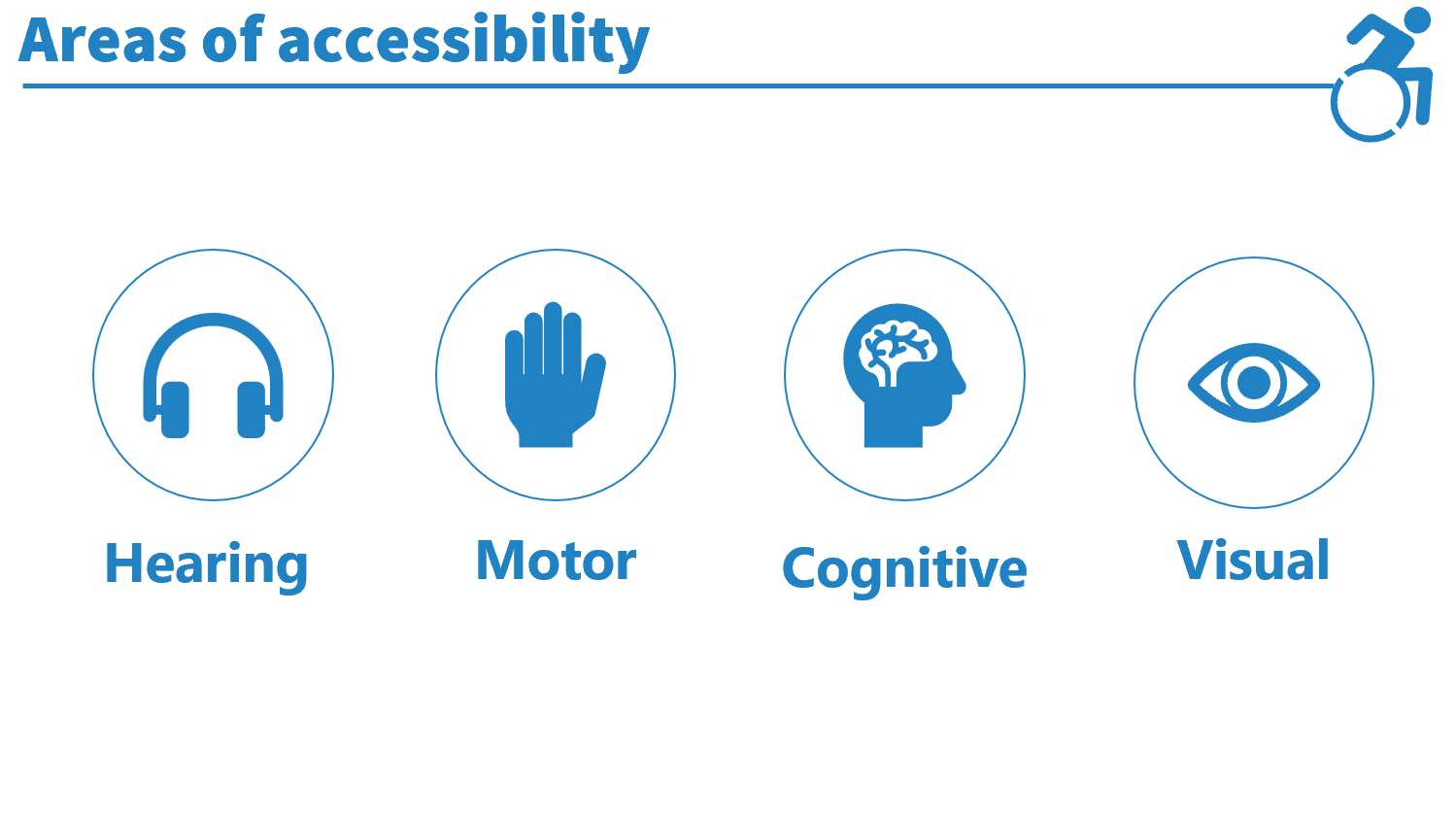
In addition to the general desire to be an effective presenter, I have a special interest in accessible design. I speak and consult on accessibility in Power BI report design. So I feel a responsibility to try to be accessible in all areas of visual design. In addition, I know that making things more accessible tends to increase usability for everyone.
PowerPoint templates in general reduce manual efforts to assign colors, set fonts and font sizes, and implement other design properties such as animations. I’m all for making a decision once, templatizing it, and making it easy to instantiate. But most of the templates available within PowerPoint and sold online don’t follow good presentation design practices. That is to say, the formatting gets in the way of the content.
Having a template made
Anyone can make a PowerPoint template. You just have to learn how master slides work. Lots of marketing and graphic design companies offer to create PowerPoint templates. But they are mostly concerned with staying on brand or making something shiny. But people make presentations because we want to communicate information. I wanted our template to make it easy for us to follow some good design practices, including accessibility.
So I reached out to my friend Echo Rivera who has her own company, Creative Research Communications, that specializes in making visually engaging presentations about highly technical topics. I came across one of her tweets a couple of years ago and visited her website. Some of the things I have learned from Echo’s courses and blog posts include:
- effective use of images
- how to avoid putting too much text on a slide
- left aligning content to make it easier to read
- I don’t need bullet points on my slides
- how to apply Gestalt Principles to presentation design
Echo worked with me to make a template that followed good design practices but was flexible enough for a variety of content and audiences. And we also made the template fairly accessible! I’m pleased with the way our template turned out. A template can’t do everything for you, but it can give you a good start.
The process of presentation template design
I found the process of designing the template interesting, so I thought I would share a bit about that.
First, I sent Echo some samples of the presentations we give and some ideas on a color palette. We met to discuss our corporate personality, our presentation needs, and our goals for the template. Then a few members of the DCAC team helped me pick some potential images for the title slide.
Next we picked icons and colors for sections that we thought we would commonly include in presentations. We stuck with a white background to make it easier to use images and diagrams from online (so we wouldn’t have to expend effort removing image backgrounds when they weren’t transparent). It also made it easier to choose colors with good contrast.
Once we got the full draft of the template, the team reviewed it and tried it out on some slides. And because things were going too smoothly, we decided we didn’t like the image we selected for the title slide, and chose another one. We made a few adjustments to default font sizes so that slides would fit our company name and slide headings with long technology names on a single line. We also adjusted the position of the slide heading text on slides with the line and icon at the top (shown below) so the text didn’t sit directly on the line.
We made a version of the slide template that has a small single-color logo on each slide. I plan to use this for sales slides and other situations where we need to ensure our name is on a slide when taken out of context (like a screenshot of a single slide). But the logo is small and not distracting so it doesn’t negatively impact design.
We made the template expecting that team members would adjust the master slides and use the provided multi-purpose layouts as needed for each presentation. We will change icons and use blank slides to add diagrams and big images. We also have multiple options for title and thank you slides.
Benefits of our new PowerPoint template
There is a lot to the new template, and examples below are shown without a ton of background explanation. But I couldn’t write this blog post and not show some examples, and I didn’t want this post to turn into a novel.
Our slides use color contrast to create visual interest while staying close to our corporate color palette.
-

An example title slide and a section header slide made using the new template. -

An example section header slide from our new template
The spacing and font sizes allow for about 6 lines of text max in an all-text slide. Our default font size for text content is 32pt.
We used icons and color to denote sections in our presentations.
-
Section header slide with blue background and relevant icon -
Content slide with matching colors and icon at the top right -
Content slide with matching colors and icon on the left
I think the best thing that this process has done is encourage us to use less text and more images. Check out the recently created slides from one of John’s presentations below.
-
John’s slide about HADR planning -

John’s slide with advice about moving resources to the cloud
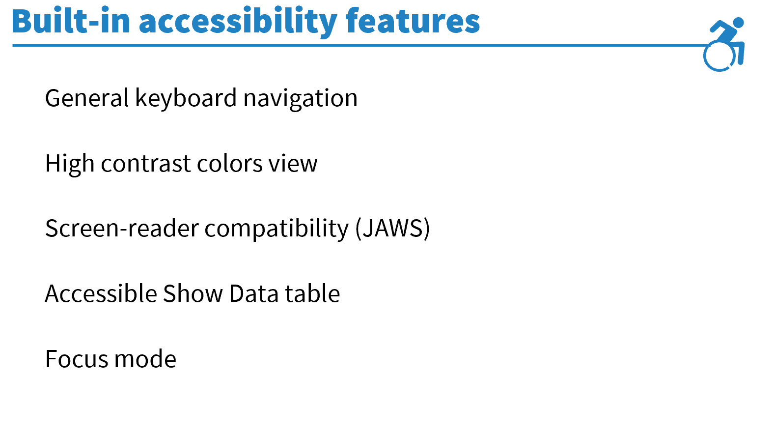
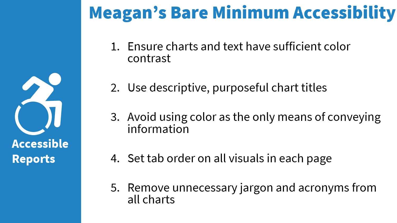
My checklist for accessibility in visual presentation design includes:
- font sizes no smaller than 24pt
- color contrast that meets WCAG standards (3:1 for large text, 4.5:1 for smaller text)
- avoiding using color as the only means of conveying information
- avoiding color combinations that are problematic for people with color vision deficiency
Echo worked patiently and diligently with me to measure and adjust colors to meet these criteria. It was great to have someone that understood these goals.
Feedback from other team members
To be honest, I think it took some time for the template to grow on people. But most of us have warmed to it. If you are used to small images, lots of text, and extensive use of clip art and smart art, switching to the template can be a bit difficult. But that’s kind of the point.
Echo gave us some videos on how to use the template and some slide makeover examples when she delivered the template, and I asked the team to watch this TEDx talk. That reinforced the design goals and choices.
I asked the team for comments, and this is what they said.
“I like having a professional-looking, themed template that isn’t just something out of the box that looks like everyone else’s. The template, plus the helpful background info force you to think about what you are puking onto a single slide. It will lead to some semi-major rewrite/re-evaluation of about every presentation I do. “
Kerry
“The template, in part with it’s notes and reminders, helps me to ensure that I put the proper amount of context on a given slide. It’s a balancing act with font size and content. If I have to reduce the font size below 32 pt and I still have content to provide, it goes on another slide.”
John
Final thoughts
Will every slide we make be perfect and beautiful? No. But this template will help us avoid common mistakes like having too much text on the slide, and it provides some built-in accessibility without us having to remember to make adjustments.
I really enjoyed working with and learning from Echo, and I recommend her for your presentation design needs. I want to note that she prefers that you take her training before she does custom design work for you so you have a mutual design foundation to build upon. But her courses are great, so that’s not a hardship.
It’s also a privilege to work with people that share and support my goals of effective presentation delivery and accessible design. PowerPoint templates are part of the branding and marketing collateral in an organization, and I love what this says about DCAC.