I recently posted a graph to twitter and asked people to explain it.
Let’s look at the graph.
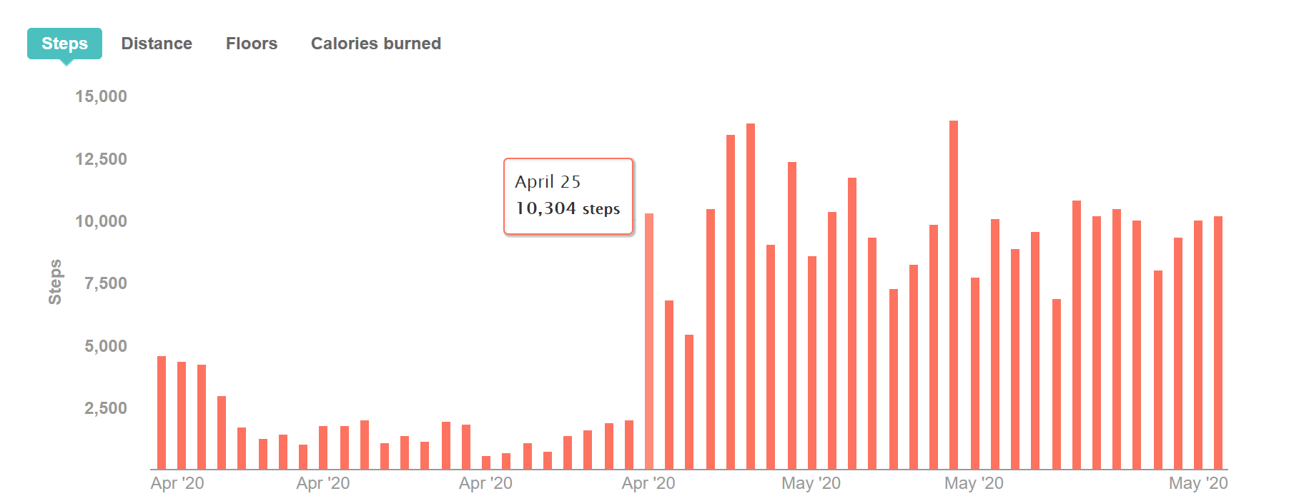
The graph is from Fitbit. It shows the number of steps I took each day between April 1 and May 23. We can see that I had a very low number of daily steps between April 1 and April 24. Then there is a spike where my steps almost quadruple on April 25. They decrease a bit for a couple of days while remaining well above the previous average. Then my steps increase again, staying up around 10,000 steps.
The Responses
The responses I received to my tweet largely fell into 3 categories:
- Complaints about the x-axis label
- Simple interpretations of the graph saying that the steps increased on April 25 and remained higher, often accompanied by statements that there isn’t enough data to explain why that happened.
- Guesses as to why the steps increased and then remained higher.
The X-Axis Label
Many of my twitter friends create data visualizations for fun and profit. It didn’t surprise me that they weren’t happy with the x-axis.
There are multiple x-axis labels that show the month and year, but the bars are at the day level. It’s unusual to see the Apr ’20 label repeated 4 times as we see in this graph. It’s not necessarily inaccurate, but its imprecision goes against convention.
The fact that multiple people commented on it demonstrates to me that it is more distracting than helpful. The way you format your data visualizations can be distracting. This is why I tweet and talk about bad charts and how to improve them for human consumption.
Literal Interpretation
Some people were only comfortable sticking with the information available in the chart. They acknowledged that the steps went up. Some said there were too many possible explanations to narrow it down to a certain reason why.
Speculative Explanations
I enjoyed the many guesses as to why my steps increased:
- I suddenly got motivated to exercise more
- I moved my office further from my bedroom
- I’m building a really big staircase
- The device used to track my steps changed
- I started playing Just Dance every day
- Covid-19 lockdown ended
A few people who know me (or at least pay attention to my twitter feed) had some insight.
I did get a new dog during the timeframe, but I got her on April 28th, not April 25th.
Also, the weather did warm up about 12 degrees Fahrenheit over the timeframe.
The Necessary Context
For the curious, here’s the real explanation.
I lost my dog Buster on April 4. He was with me for over 9 years, and he was my best friend. He was suddenly not feeling well at the end of March, and he was diagnosed with cancer. He declined rapidly, and I stayed with him on the living room floor until it was time to say goodbye. During those first 4 days of April, I really only left the living room to take Buster outside. I slept a lot that weekend and didn’t move much because I was sad.
With losing Buster, everything associated with Covid-19, and some other personal issues, I was depressed for the next few weeks. But I was also very busy with work. I had no energy to do anything else after work. And there wasn’t much to do since my city and state were on lockdown for Covid-19.
On April 25, I decided that the only way to get out of the emotional hole I was in was to get up and do something, so I walked a few miles around a nearby park. I came home and looked on PetFinder.com to see if there was a dog I’d like to adopt, and I came across a bulldog mix at Foothills Animal Shelter. I hadn’t cleaned my house since Buster died (see: depression). So I spent the rest of the weekend cleaning and dog-proofing just in case I brought the dog home.
On April 28, I adopted Izzy, a bulldog/boxer mix.
Izzy likes to walk. We walk between 2 and 4 miles each day. She is most of the reason the step count remained high throughout May.
Nice Dog. So What?
I hope what you’ll take away from this story is that to really deliver insights, you need to know the subject of your data visualizations. You need domain expertise. And it helps to have your own observations or other datasets to support the events you are visualizing.
If you don’t know me, any of the speculations could be the right answer. And the most you could do with my Fitbit data is to provide descriptive analysis, simply saying what happened without going into why. Many people who follow me on Twitter knew I recently got a dog. That explains the increase in step count from May 28 going forward. But it doesn’t address May 25th. Without the additional context of my step count in other months, you don’t know what my average step count is outside of this view. You wouldn’t know if my average count is normally closer to 3,000 or 10,000 because you don’t have that data. This is a perfect example of where you would need more data, more months of this data as well as additional datasets, to understand what is really going on. Sometimes there are actual datasets we can acquire, like weather data or Covid-19 lockdown dates. But there is no dataset for me losing Buster or struggling with depression.
This is part of why I prefer the term “data-informed decisions” over “data-driven decisions”. We often don’t have all the data to really understand what is going on. Technology has improved (see: Power BI) to make it quicker and easier to mash up data to provide a more complete picture. But we’ll still have to make decisions based upon incomplete data. If we have domain expertise, we may need to review data and ask questions to get better insights, and then rely on our knowledge and experiences to complete the picture.
This chart is also a good representation of a common issue in business intelligence: we often settle for only descriptive analytics. It may even have been a struggle just to get there. Let’s say I’m trying to become more active and using step count as a metric. You see this chart and see the increase in steps and say “That’s great. Do whatever you did last month to increase your steps even more.” Am I supposed to get another dog? Get less depressed?
Let’s pretend that my chart is not about my step count but is an operational report for an organization. That one chart tells you a trend of a single measure. We need more data, more visuals for this information to be impactful. The additional data adds necessary context. If this were a Power BI report, we might use interactivity to provide navigation paths to explore common questions about the data and to help identify what is influencing the current trend. Then you could use the report to facilitate a more productive conversation. I’m not addressing AI here, but after understanding the data and decisions made from it, you might introduce some machine learning to automate the analysis process.
Just having a report on something is not enough. The goal of data visualization is not to show off your data (if your service/product is data, that’s a different thing). It’s to help provide meaningful information to people so they can make decisions and take action. In order to do that, we need to understand our audience, the domain in which they are operating, and the questions they are trying to answer. Data visualization tools make it easy to get things on the page, but I hope you are designing your visualizations purposefully to facilitate data-informed decisions.