Using layout images in Power BI has become a popular design trend. When I say layout images, I’m referring to background images with shapes around areas where visuals are placed. This is different from the new wallpaper feature that became available in the July release, which can be used to format the grey area outside your report page and extend the main color of background images.
Layout images can help with spacing and alignment within a report and can help create consistency across reports. They can also help create affordances, using consistent layout and design to make it obvious how users should interact with our reports.
I use layout images in some of my reports, but I don’t think they are necessary on every report. There are a couple of things to consider when using layout images.
- Don’t let your layout image take the focus away from the data. This can happen due to lack of color contrast or because the color(s) used in the layout image are much more intense than the visuals on your report page.
- While we may strive for consistency in report design, especially in larger organizations, we can’t let a layout keep us from creating the most effective visual to communicate the information in our data. If we start with a layout and limit ourselves to only visuals that fit that layout, that constraint may prevent us from creating a better report. If you have identified the chart type you need to communicate your information, but it doesn’t fit in your 3-column layout because the visual needs to be a bit wider, get a new template that accommodates your visual. I would rather see slightly different templates than ineffective chart types or the right chart types but the visuals squished into a space where they don’t fit (hard to read, truncated labels, etc.).
You can make your own layout images or choose one that someone else has created. PowerBI.Tips offers Power BI layouts in the form of Power BI Templates (.PBIT files) with background images set on the report pages where you replace the data source and repopulate the visuals. The templates also contain report themes.
Frederik Hedenstrom has a grid generator where you can set the width, height, columns, spacing, and colors. Then you can download your image and set it as your page background.
When I make my own layouts, I typically just use PowerPoint. Usually, the layout is the last thing I add rather than the first, but you can do what works best for you. This is the process I use to make layout images:
- Take a screenshot of my report page and paste it onto a blank PowerPoint slide.
- Draw shapes (usually rectangles or rectangles with rounded corners) over the screenshot where the visuals are placed.
- Delete the screenshot from the slide.
- Format the slide background and the shapes (alignment, colors, outline, shadow effects, etc.).
- Export the slide as an image.
- Import the image as the page background. Adjust the image fit and transparency as needed.
Doing it myself is a bit of work, but it means I get exactly the effect I want. And I’ve gotten pretty quick at it now that I have done it several times. But again, you can take shortcuts using the resources mentioned above. Once I have my background layout image set, I check that it isn’t too distracting by asking myself these questions:
- Is the background more intense than the visuals to where I look at it before I look at the data visualizations?
- Do my visuals no longer stand out because the background color is too similar to the colors in my visuals?
- Can I still clearly read my charts, including all titles and labels now that the background image is in place?
To help illustrate my points, take a look at this example report I have been working on.
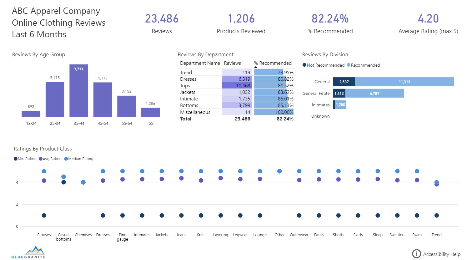
In Version 1, there is no layout image. Some might think the report looks a tad bare. While there is a layout of 3 rows, it’s not immediately obvious.
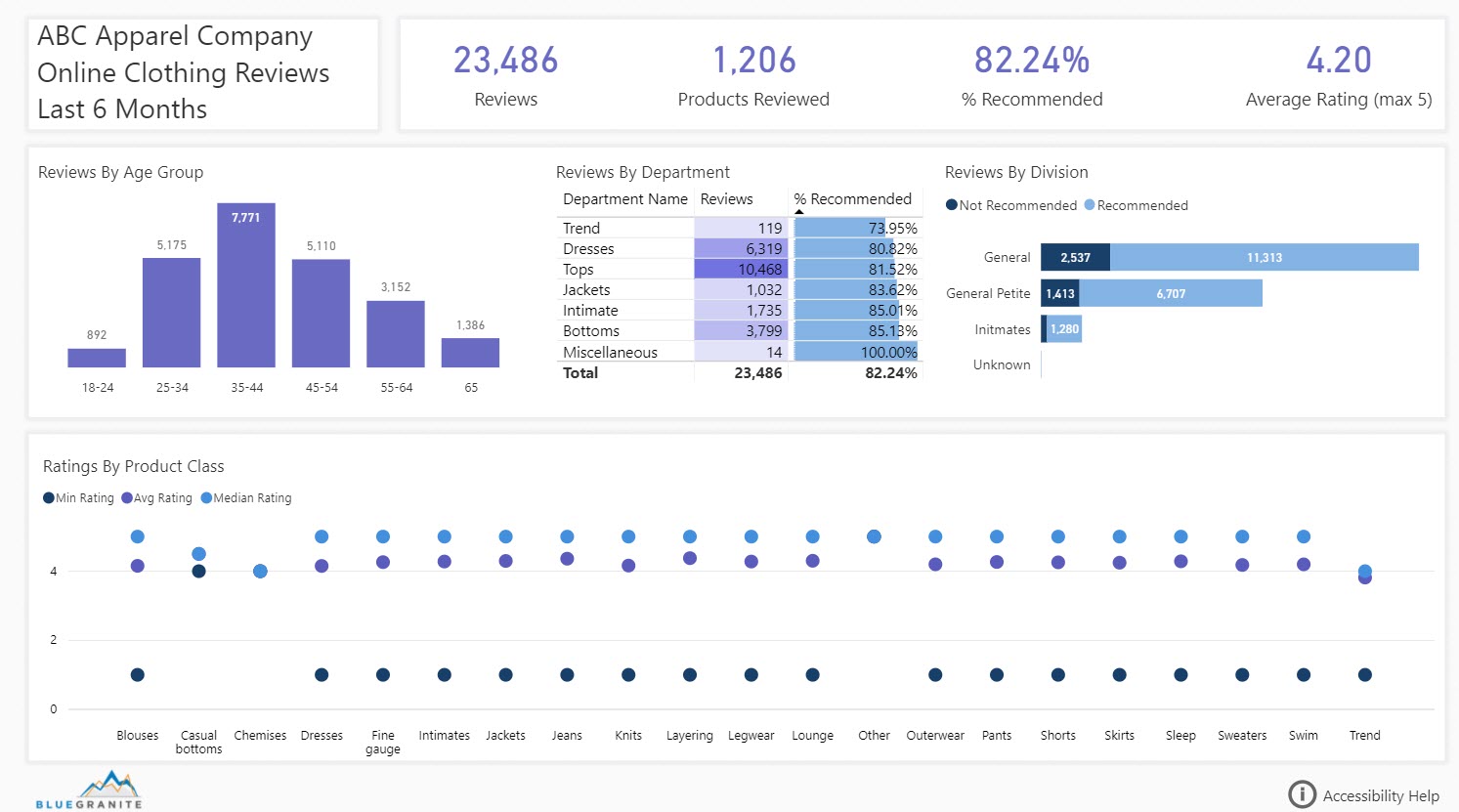
In version 2, I have applied a layout image. It is subtle, using a light gray background color and a soft shadow around the shapes. It emphasizes the 3 rows, which makes sense in this report. In the top row I have the title and some summary numbers. In the middle row, I’m slicing number of reviews and % recommended by high-level categories. In the bottom row I have one visual that slices average and median ratings by a more detailed category.
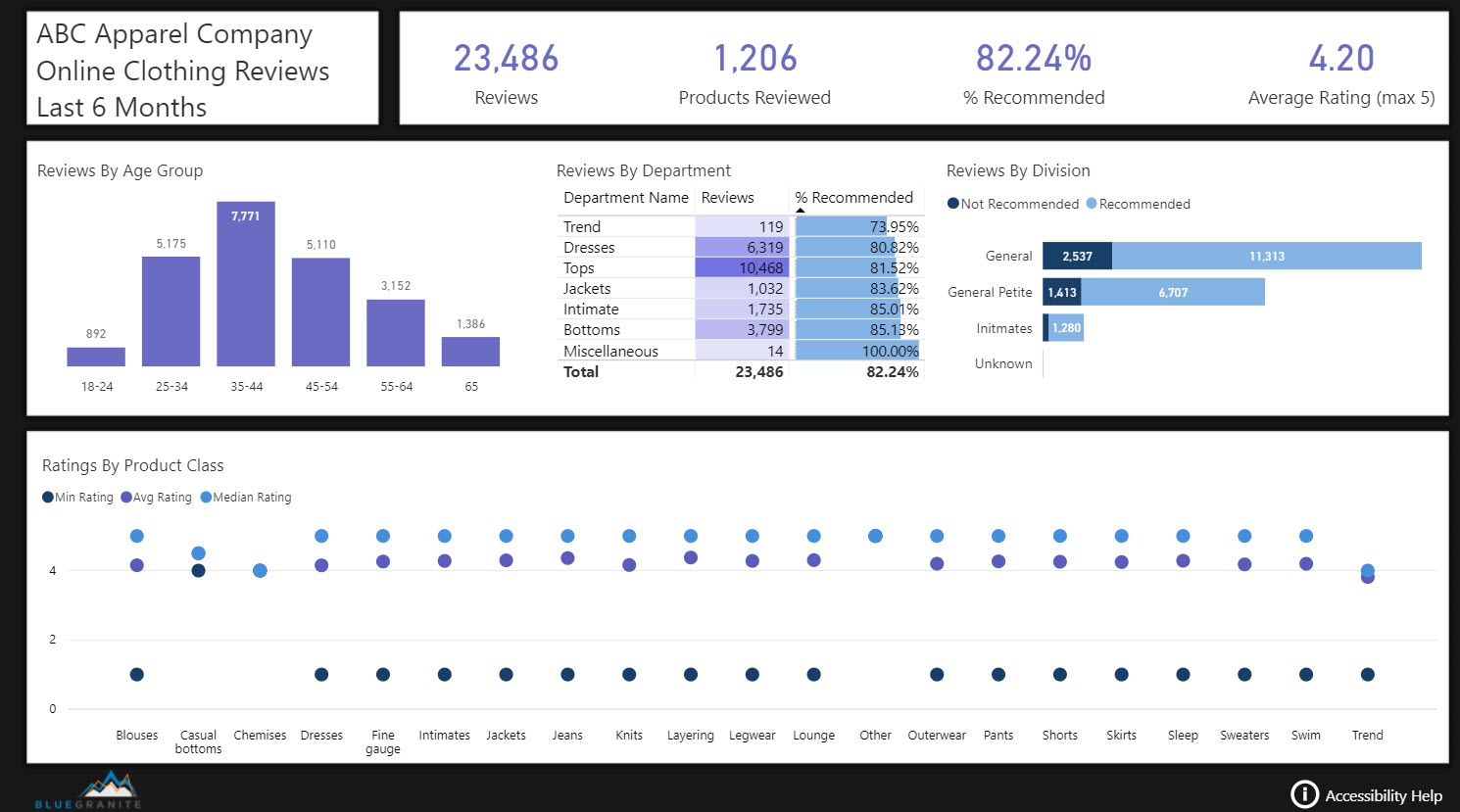
In version 3, I changed the background to a dark gray/light black. With that background, the dark color is the thing in the report that stands out most to me, but it provides no information and doesn’t enhance the user experience more than the subtle light version of the layout image.
Final Thoughts
Layout images can be useful. You can save time by using images created by others, but don’t let a layout needlessly constrain your data visualization or distract from the information in your report.